
KHM-LOGO

THE LOGO
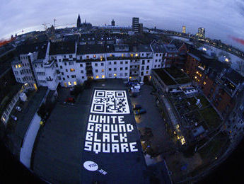
WHITE GROUND BLACK SQUARE
The KHM logo looks like a black square. And that is what it is. But that’s not all that it is: there is much more to it! When the designers Uwe Loesch and Michael Wichelhaus created the logo for the newly founded academy in 1990, they chose a form that offers many possibilities to draw connections.
The history of art over the last century has been full of obsessions for the square: one thinks of Kazimir Malevich’s Black Square, Hans Richter’s early experimental films, Samuel Beckett’s television play Square, John Baldessari’s photo series Throwing four balls in the air to get a square etc. Squares have the advantage of being neither ornamental nor directional. As a neutral straight shape, neither portrait nor landscape, they illustrate the importance of each and every artistic decision concerning format (we are not limited to the big screen!).
If you look at the logo more closely, it also becomes clear that it differs greatly from Malevich’s Black Square. It does, in fact, have two sharp and two blurred edges. The black seems rich in contrast on the sharp edges, but diffuse on the blurred edges. From this perspective, the KHM logo turns out to be a test image for questions of perception. And there’s more: one knows, since Goethe’s Theory of Colours, that colour phenomena can appear at the border between black and white under certain light conditions (this can be tested on the edge of a window frame in the light of morning).
Our
black square is therefore not only black, but also virtually coloured. The KHM logo
thus touches on questions of design, art and film history, of format and
perception. And if you enter the KHM address Filzengraben Köln in Google
Earth, you will discover the following text written on a flat roof: WHITE
GROUND BLACK SQUARE. Next to it is a square made up of smaller squares. It
is the KHM’s QR code. So the logo returns technologically. The black square has
arrived in the Information Age.
Peter Bexte
REMOTEWORDs / 25. Station an der KHM und ein Buchprojekt
RW.25: Langzeitprojekt und Dachinstallation von Uta Kopp / Achim Mohné zu 25 Jahre KHM / 2015,
Filzengraben 18-24, 50676 Köln
Buchprojekt: Orbitale Irritationen, 2018, Van Halem Verlag + KHM


 QR-Code / Dachinstallation |
 |
 Publikation "Orbitale Irritationen" mit RW.25 |
Downloads